Photographing Artwork for Prints
One of the questions I get asked the most by fellow artists and artisans is how to best photograph your work for reproduction. I've been asked enough times over the last few months that I thought I would write a blog about my process. I figured it might help out those who are struggling and perhaps some of my buyers and clients will find it interesting as well. I'll be honest, learning how best to do this was...HARD. I have a lot of help, and even with that help sometimes I find myself stuck. I don't claim to be an expert on this subject, and it is an ever evolving process. There may also be loads of better ways to do this. But I thought I would share my methods in the hopes that it helps some folks.
For two dimensional art, there are really two ways you can make reproductions. You can have your work scanned, or you can photograph it. I've done both. Unforuntately, I find scanning to be extremely cost prohibitive. Some of my original works are quite large. This means I must take them to a proffesional print shop where they have large flat bed scanners much larger than I could ever afford at home. They usually charge per size, and the larger works can get quite pricey, upwards of forty, fifty, even sixty dollars or more. If you are a struggling independent artist like myself, that can add up and hurt the wallet! Results may also vary, depending on your print shop, the scanner, and the tech who is doing the post work on the photos. That is too many variables for me. In fact, I've had scans come back that look totally different from the original paintings. I just...don't dig that. I am a control freak over my own artwork. So I opt to photograph my art in house, myself...with a bit of help!
The first step to photographing your art is to have a really nice camera. My cell phone just doesn't cut it. I've heard that some of the newer iPhones have great cameras, but being a Samsung girl I wouldn't know. The larger and more high res you can take the original photos, the better. I don't profess to be anywhere near an expert on cameras. I am fortunate that my fiance is a pretty great hobbist photographer. Truly, my prints would not come out nearly as nice if it wasn't for Geoff's assistance. I am very lucky to have him as a resource. He owns a Canon T3i. For Christmas a few years ago he gave me a refurbished Canon SL1. We use both of these on occasion to take my photos, probably defaulting to the T3i most often. He has a Canon EF-S 55-250mm zoom telephoto lens, and we use this for the photos also. Do you need a dslr camera and a lens THIS fancy? To be honest, I am unsure. I just know that given what we have available to us, this produces the best images to start from. You may be able to use a nice, compact, automatic digital camera and be fine. If you have one, I would at least start there before investing in more gear. Play around and see what your results are.
For those that are in the know for the deeper photographer stuff, Geoff sets the aperature to either 5.6 or 8.0 depending on the piece and the lighting for ensured sharpness of the pictures, and the ISO to 100 to ensure the photos have less noise. He uses manual focus to we can have more control over how sharp the images are. The telephoto lens helps with distortion. Since we are photographing flat pieces of artwork, some lens may cause the corners of the canvas to bend or warp, maing it challening to end up with a nice, square photo. Ithis lens also helps hide the tooth of the canvas. Canvas has a distinct texture to it. While this doesnt really effect how a painting is viewed, it can sometimes distract or distort the look of a print.
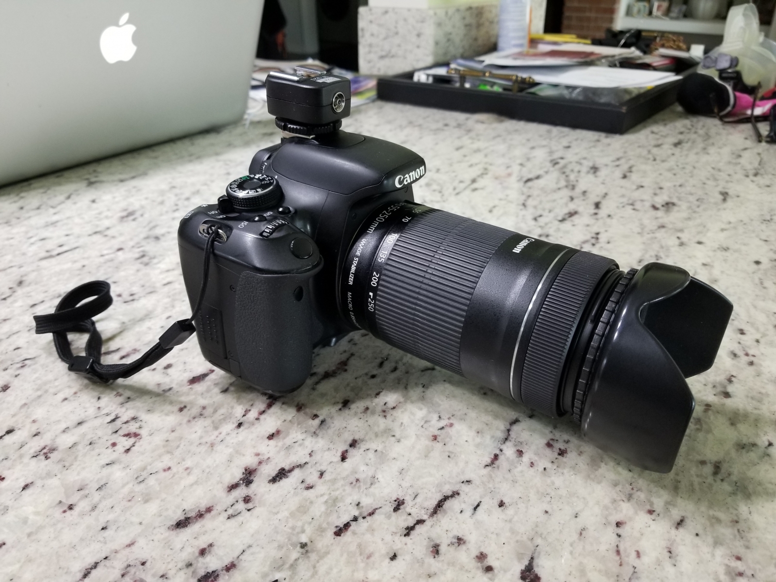
(Geoff's Canon T3i with his telephoto lens)
The next step to taking great photos is a tripod. You may think you have steady hands, but even the slightest, undetectable movement when shooting with a longer exposure while trying to capture a flat piece of artwork will result in blur-city, population you every time. Because we set the ISO at 100, it takes about 3 to 5 seconds to take the picture. Any movement, even the slightest shake of the hand on this setting, or even taking a breath while holding the camera, and the photos will be blurry. You can use a big tripod like in the photo below, or I have seen mini ones available. You could set little ones on a table top or a stack of books, or any flat surface really. But you will need one of some kind in oder to ensure your photos are crisp and clean.
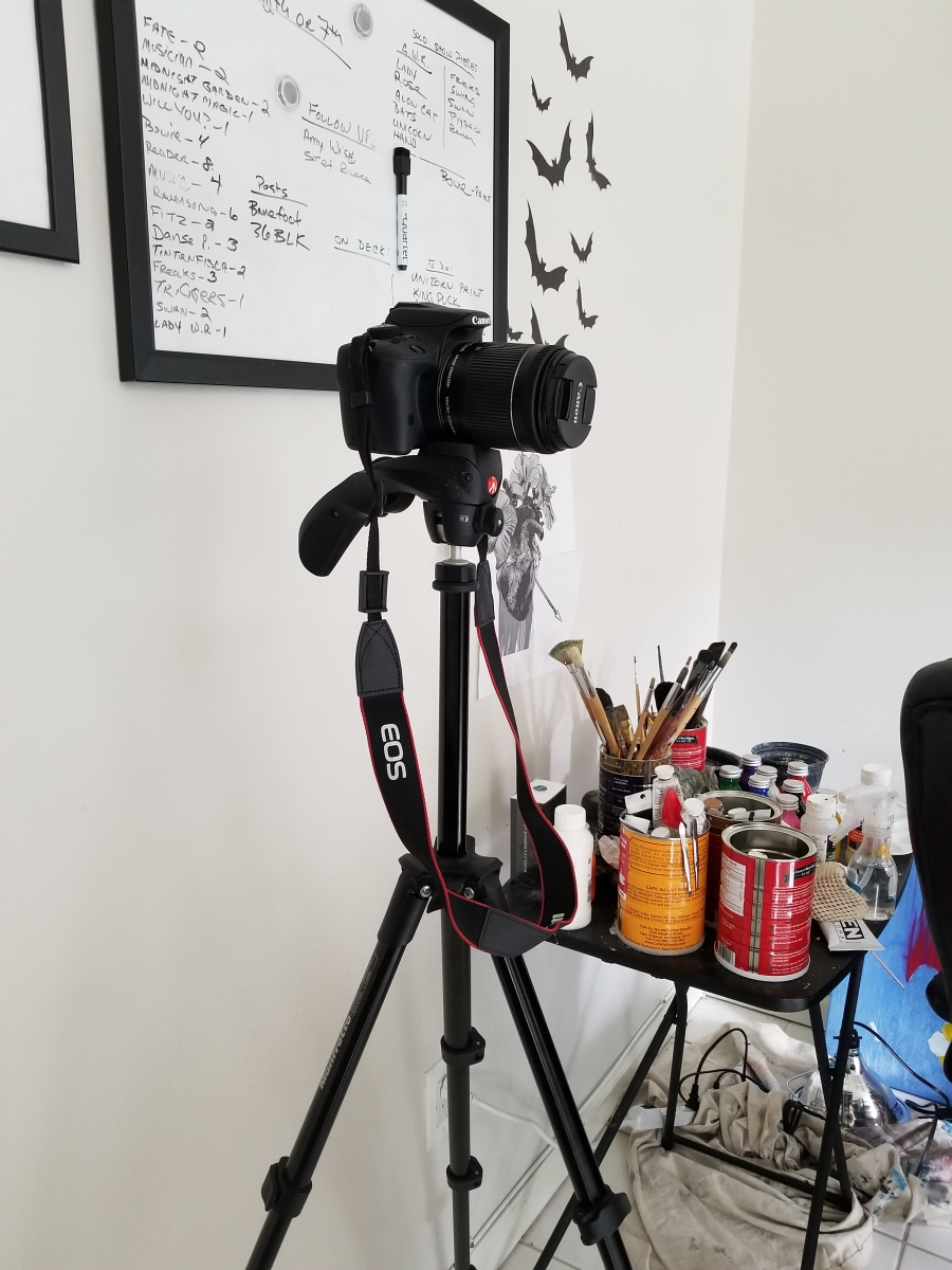
(all hail the mighty tripod)
Once you have your gear and settings in place, it's time to think about lighting. Natural light takes better photos that artificial, at least in our case. We played with lamps, clip lights, and overheads. But warm lights were making the photos too yellow, and LED lights were making them too blue. We had a nice fancy flash in the mix at one point, but unfortunately the adapter for it broke. So we use a natural lighting method.
The very best times of the day to find the best light are super early in the morning, or dusk. Now...Geoff and I are self professed vampires. We are never up earlier than we have to be. Since most of our photography sessions happen on the weekends due to how long it takes to set up and break down everything, we.....always miss early mornings. Dusk can also be problematic in Florida. You never know when an afternoon or evening thunderstorm is going to roll in and take all your light away. Our solution? To just do the best we can. The earlier in the day the better.
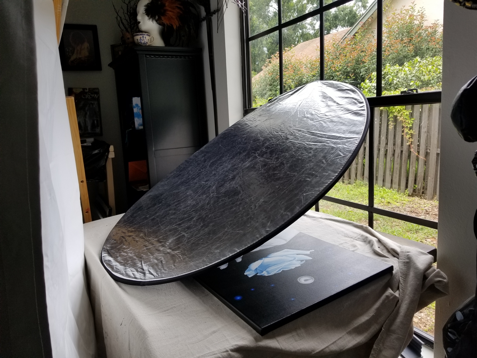
My studio is the brightest room in the house. In fact, how bright this room is was a selling point for us to buy the house. That said, we still need to direct it a bit. What we try to achieve is a mixture of diffused and redirected light. We want light to bounce off the white ceiling in this room, which will then, in turn, shine down onto the painting. The rest of this light we want to try and diffuse a little because it will help in masking the tooth of the canvas. We do this with this reflector pictured below. Here, we are taking the incoming light from the window, and directing it up to the ceiling of the room. If you don't have a photo reflector, you could try a car sun shade, or some tin foil, or something else kind of shiny.
From here, we use to proceed with taking the photos. What we found was the light coming in from the window was so strong it shown right through the canvas, causing weird artifacts and strange points of light in the photo. It also caused bleeding around the edges of the canvas, fading out those edges, and, in some cases caused lens flare. In order to curb these variables, while still using the general light in the room, over the years we have devleoped this little back drop method, consisting of a blackout curtain, some clamps to hold the fabric, and two anchor points: Here it is cliped to another tripod on one side, and an easel on the other.
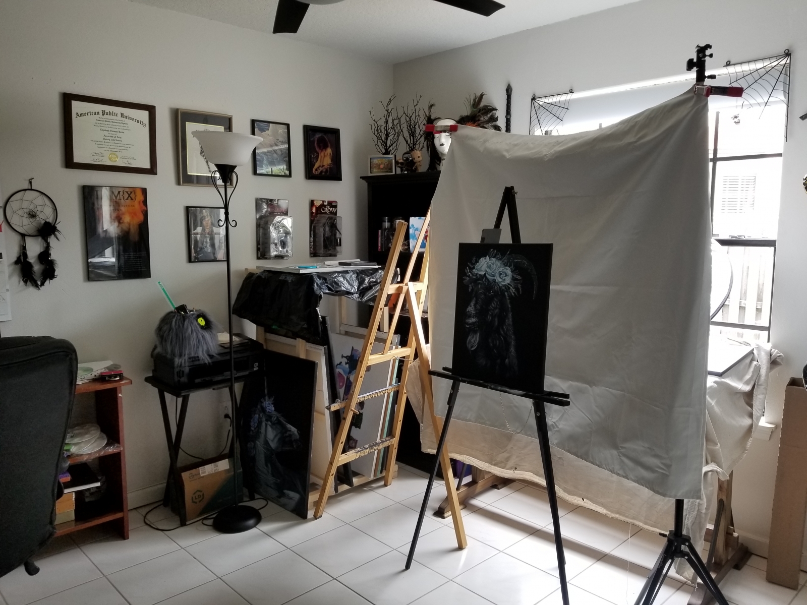
In this photo you can see now there is still plenty of amibent light coming into the room, but the artwork, in this case King Puck, is protected. No light will show through the canvas to cause weird spoting and fading, and the blackout curtain extends past all the canvas edges to ensure the photo is as balanced as we can possibly try and get it. On top of the painting you can see Geoff's grey card. This is used to try and adjust the white balance in the photo in post. More on that later.
Now, there are other ways you can try and get a nice, even lighting set up. If its early and a little overcast outside, you can try just taking your easel out in your yard and shooting there. Your results will depend on the weather, but I know some artists have luck with this choice. Other artists get a light box and shoot their work using that type of set up. It's really all about how much you are willing to spend, what works for you, or simply what you have access to. We found trying to shoot outside was too much of a gamble. When you have a show coming up in which you want to exhibit your work, and you only have the one weekend to photograph it before you submit it, where it might possibly sell, and it rains that entire weekend....well, that's a bummer. This happened to me once before. We couldn't get a good photo that weekend, into the show went the painting, and BOOM, it sold. Don't get me wrong, I was gidy over the sale. But now I can't make prints of that work....ever. We also might be photographing two paintings that day, a dark one, and a light one. The light may be great for one piece and not for the other. There is just a lot of weirdness that can happen. Many light box set ups are too small for my larger works, and so we have not yet pursued that path. For smaller works, or something like jewelry, a light box set up might be perfect. We have found this method to be the most reliable one for our process at this time.
Each piece is usually photographed a dozen or so times.This way there are a lot of images to choose from in post. Sometimes a cloud comes along and covers the sun, and one image comes out too dark. Sometimes the tripod slips loose and a photo comes out blurry. Sometimes the way the painting sits on the easel makes the photo appear too crooked to work with. Its best to keep tweaking, adjusting, and snapping, having a handful to choose from just in case.
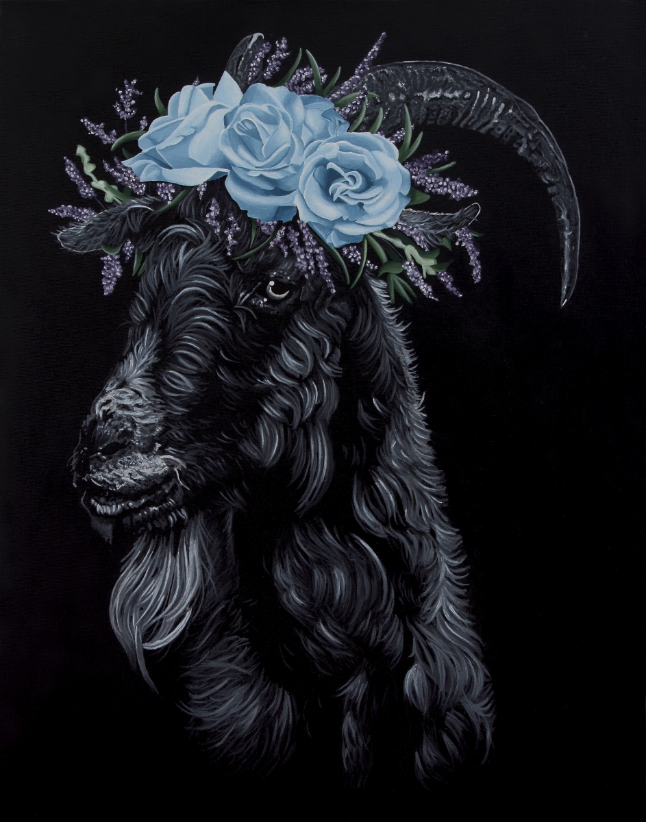
Here is the raw image from the King Puck shoot I used for prints:

This particular painting happened to photograph very well. Some pieces photograpgh better than others. Again, there are so many variables here. It depends on the colors I used in the painting. it depends on the amount of light. However, even though this photogrpahed really well, there are elements that are lost in the process. As you can see, the ambient light did bounce off the black background of the painting in places, making it look slightly grey, not the true black it is in person. Also, the roses in the headdress, lavender sprigs, and leaves are ever so slightly washed out. You can also see where some lint fell onto the piece while we were handling it, and now those are showing in the resulting photograph. And, of course, the easel, the grey card, and the blackout curtain are all in the photograph I really, really strive hard to make sure all of my prints look as close to the original piece of art as possible. So, in order to achieve this in this case, We've got to do a little work in post.
How you decide to clean up your photos is really preference and what software you are familiar with. Geoff is great with Adobe Lightroom. I have no idea what I am doing in Lightroom. It's on my to do list to teach myself that program. But I do have a few years experience playing around in Photoshop. Again, I am no expert, but I can at least show myself around. When I get stuck, Youtube tutorials are my best friend. I sketch out all of my painting ideas in Photoshop first, so it's just my preference to use when I clean them up. Is Lightroom or Photoshop neccessary? Maybe not. There may be loads of photo editing software out there that is easier to learn and use. This is just what I have access to and am familiar with.
So, from here, I will take the raw image of King Puck. I'll adjust the image if it is slightly crooked. I'll crop out the background of the photo. I'll rubber stamp out the lint. I'll bump the contrast a little bit to bring back some of that true black in the background, check the white balance, and I'll adjust the colors and saturation in the headdress to mimic what the painting looks like in person as close as I can possibly can. I will also take this time to ensure the photo is a good aspect ratio for prints, whether an 8 by 10 or an 11 by 14. Sometimes my paintings are different sizes, and I can only offer prints in a certain aspect ration without losing any of the painting. In the case of King Puck, here was the end result:
Now comes the moment of truth! I take my digital image to my print shop, have a print made, and compare it to the original. If it prints a little too dark, or the color saturation is off, I'll adjust my finished photo and try again. I really do try to get them as close as I possibly can. I want my clients buying prints to feel like they are getting the most faithful representation possible.
Are we finished? ....MAYBE....Next comes the challenging part. I will be honest, I am not sure I have found a bullet proof way of adjusting for this. My finished photo might make completely faithful copies. The prints look true and the fidelity is spot on. But when I upload the digital photo to my webstore as a product photo, it will look great on my computer, and lousey on Geoff's computer. It will look great on his phone, and crummy on my phone. On one device it might look way too dark. On another device it might look washed out or has artifacts I didn't see on my machine during the post production process. Sometimes I will upload a photo to Facebook, and in the compression Facebook does on their photos the result is pixelated or has artifacts. Why do these things happen? Because colors and contrast can vary so much from device to device. It depends on the quality of the screen, the settings each person likes to use, sometimes the age of the device, or the standards of a website....there can be SO many factors. So, even though the photo looks good on my machine, and the physical print looks great, there is a chance it might not look nice and true to life on someone else's computer. Below is an example:
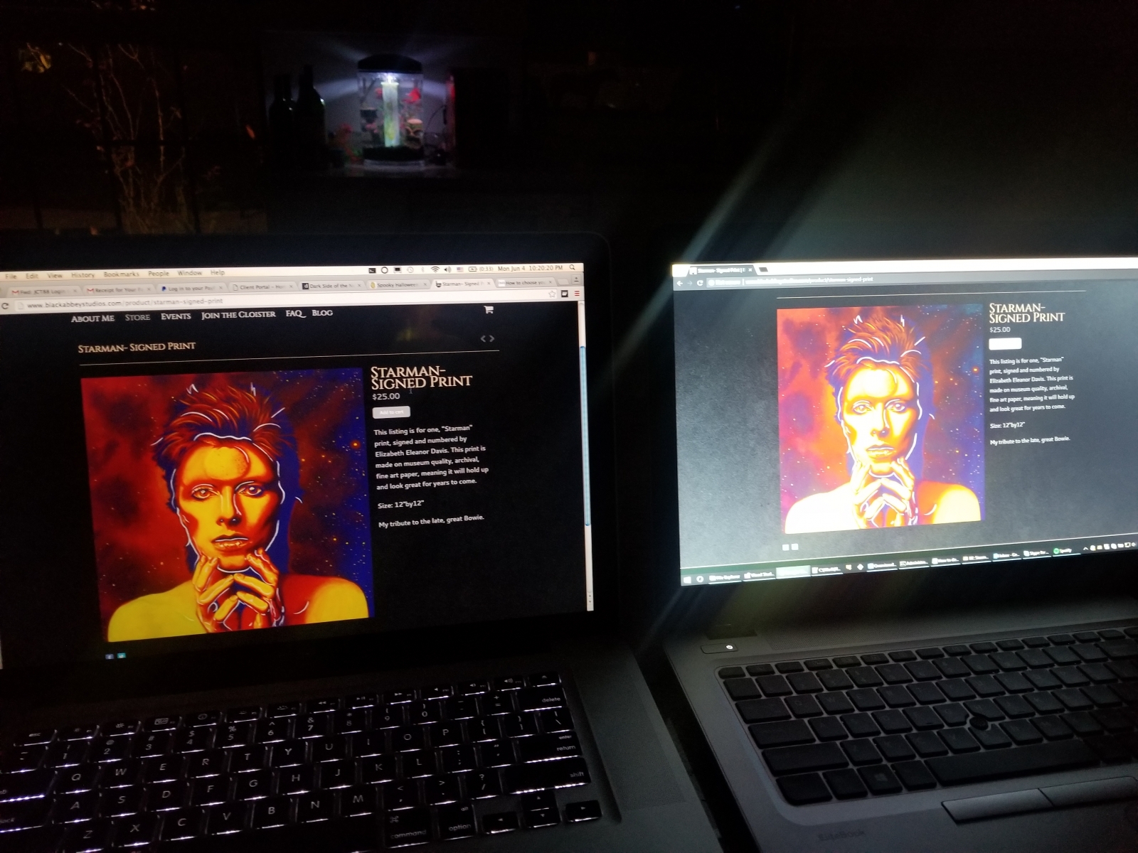
Now, granted, there is a little screen glare from photographing a birght monitor, but that aside, you can clearly see the very same webpage, the very same image, looking completely different on two different machines. The left is my personal laptop, where I do all my post work, and the left is a cheaper machine we have in the house. Which one looks like the painting? Well, I can assure you that, on my life, it looks exactly like the image on the left. So, how do I fix this kind of variance? Lately, this has been my quest. I am still trying to figure it out. My friends will all tell you, I am constantly sending them links to my website saying "how does this look on your computer? Are the blacks washed out? Are the colors blown out? Do you see artifacts? How is the brightness and constrast?" and take their feedback in consdieration while editing a photo. But it does drive me crazy that someone may be viewing my work in...less than the best light. For now, I try and figure out a good middle ground and hope for the best. Sometimes I have two separate digital images for a painting, one for making prints, the other adjusted for a product photo in the webstore.
It can take me anywhere between a day or two to a full week to photograph, edit, and test print a new work. I try and do a few together to limit the disruption of setting up and breaking down photo equipment in the studio. There are times I get stuck in the editing process and need to go learn a technique or two in order to get the fidelity I require. I could let a digital artist or photographer do this for me. That might be an option for others out there if they aren't very tech savvy or, honestly, do not want the headache. But from my experience what I have found is that, no two people see the same piece of artwork QUITE the same. Not everyone has the ability to see all colors the same. Not everyone has an eye for contrast. When I let others attempt to edit photos of my work, I found they often don't see what I see while looking at my art. That isn't their fault. Afterall, I am the one that painted it. I know what colors I used, what my intension was, what the exact mood and tone of each work is. Sometimes, even talented image editors just don't see it the way you do. Again, when it comes to my work, I am an admitted control freak. I need it to look and feel exactly how I painted it. I have a hard time letting go and letting someone else take the reigns. While it is hard work, I get satisfaction from doing it myself, and as I move forward, I am hoping that I continue to improve the post process.
That is how my art is photographed! I hope this is helpful to some of you, or at the very least gives you a little window into the work that goes into making my reproductions. If you have any tips to share, I am always happy to learn more, and if you have any questions, feel free to ask!


